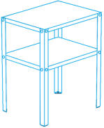
When designing the image targets, I
wanted to make something that
would fit in with the other graphics
and visuals found in IKEA instructions.
I took into account corners, line
caps, spacing, roundness, and color.
AR Awesome
All images are owned by Eli Boahen, and cannot be used without express permission from them.


Over the course of a month, my team and I explored how a
brand can add another dimension to their products and
Customer Experience ( CX ) through AR.
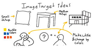
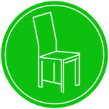
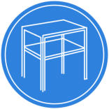
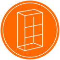
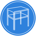
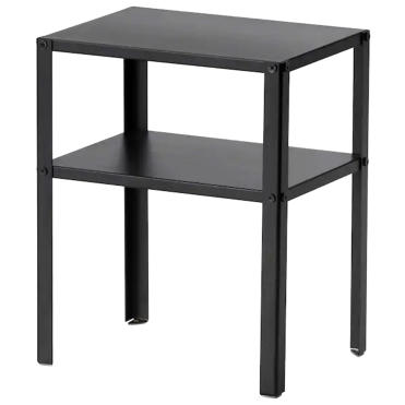
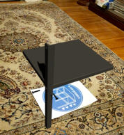
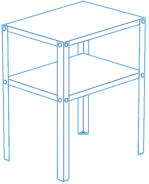
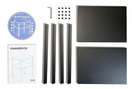
These were the initial image targets
designed for our app. The first icon
mimics the KNARREVIK ( the furniture
my team chose ). The others use
about the same number of lines as
the first icon; I felt that this was a
constraint that helped me connect
the icons. We only needed one
image target for our project, however
we made multiple icons for future
features.


Scott Faress
Foundations
Developer
Ian Curtis
Animator / AR
Developer
Eli Boahen
UX / UI Designer
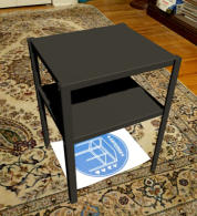
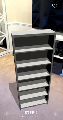
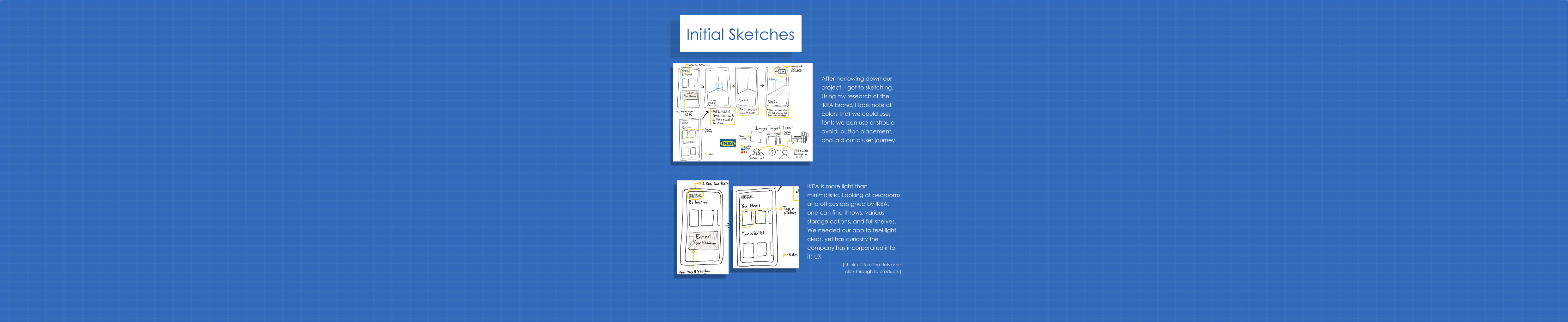
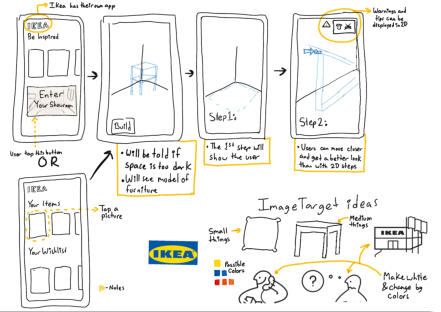
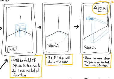
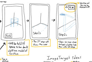
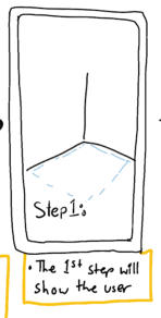
Step by step, the
sketches turned into
prototypes, that
turned into our app
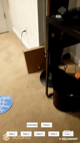

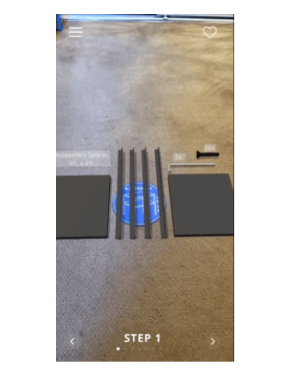
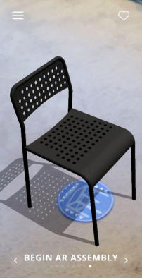
It was interesting working on a
product where instead of
introducing users to an AR feature
or tool, my team and I built on
existing AR. This may seem
adventitious; however, it required
a lot of research and delicate
changes because a user can tell
“This doesn’t feel like IKEA made
this” amongst other feedback.
Achieving this within our time
constraint was a challenge, but I
feel that we created a product
that could become a great tool
for users with a few more iterations
and developments.

 Watch My
Presentation
Watch My
Presentation